PDP Redesign
Creating a clearer, faster, and more conversion-focused product experience across e-commerce PDPs
My role was to redesign product detail pages for e-commerce brands, helping users discover products, evaluate key information, compare variants, and make purchase decisions with less friction. I worked across multiple client websites, improving product hierarchy, CTA visibility, variant selection, reviews, product imagery, and overall page structure while staying within existing brand guidelines.
Project Overview
The Product Detail Page is one of the most important decision-making points in an e-commerce journey. It needs to communicate what the product is, why it is valuable, how much it costs, what options are available, and how to purchase it, all within a few seconds of scanning.
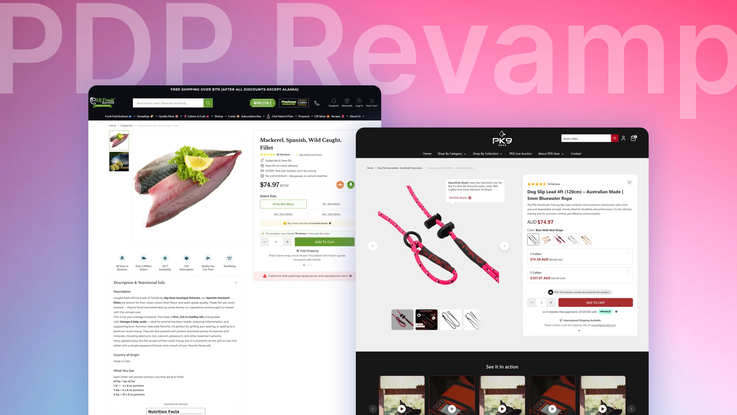
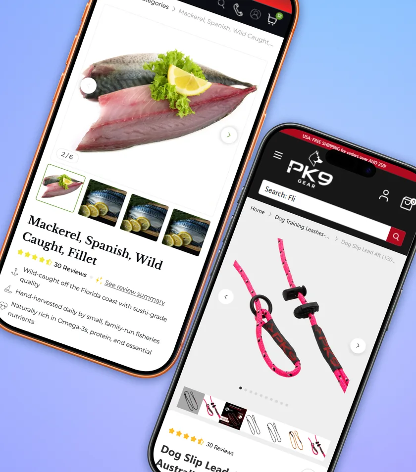
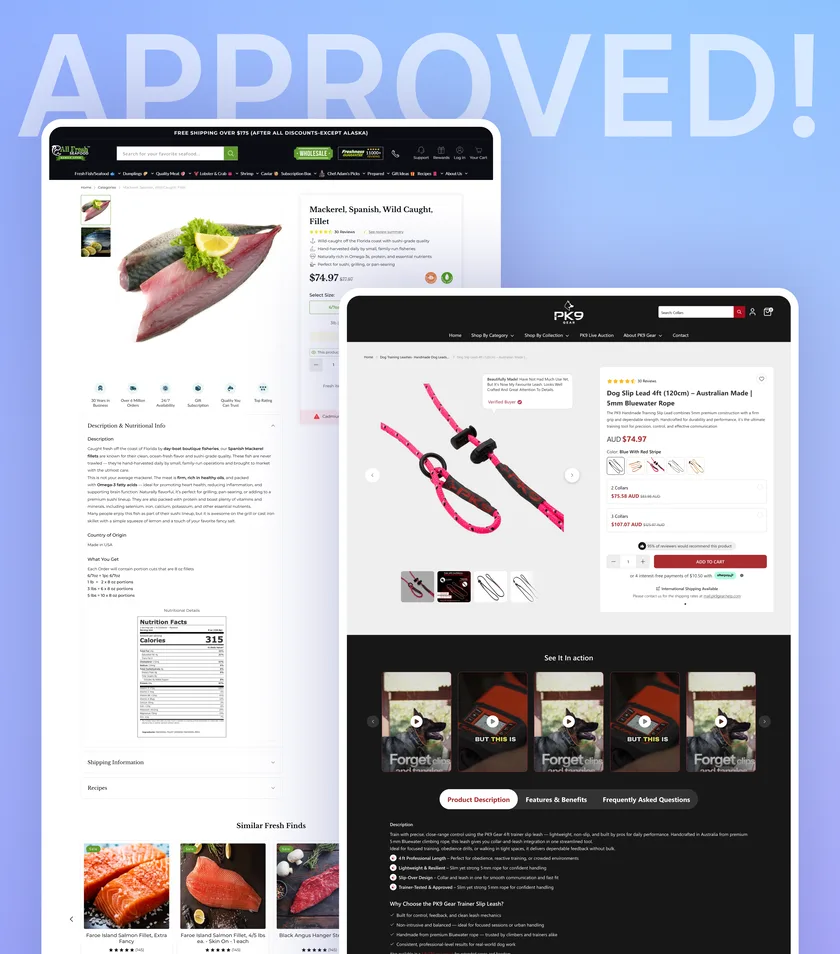
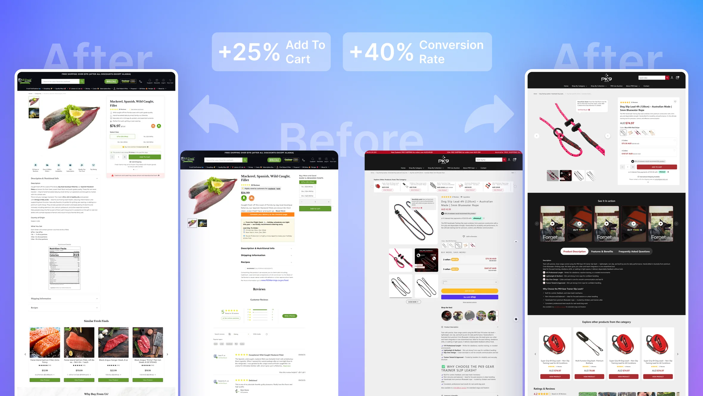
The goal of this project was to redesign PDP experiences for multiple ConvertCart clients, including All Fresh Seafood and PK9 Gear, by improving information hierarchy, reducing visual clutter, strengthening the primary purchase actions, and making product selection faster and easier.
Rather than introducing completely new visual systems, the redesigns were created within each client’s existing brand language while improving the structure and usability of the page.
The Business Challenge
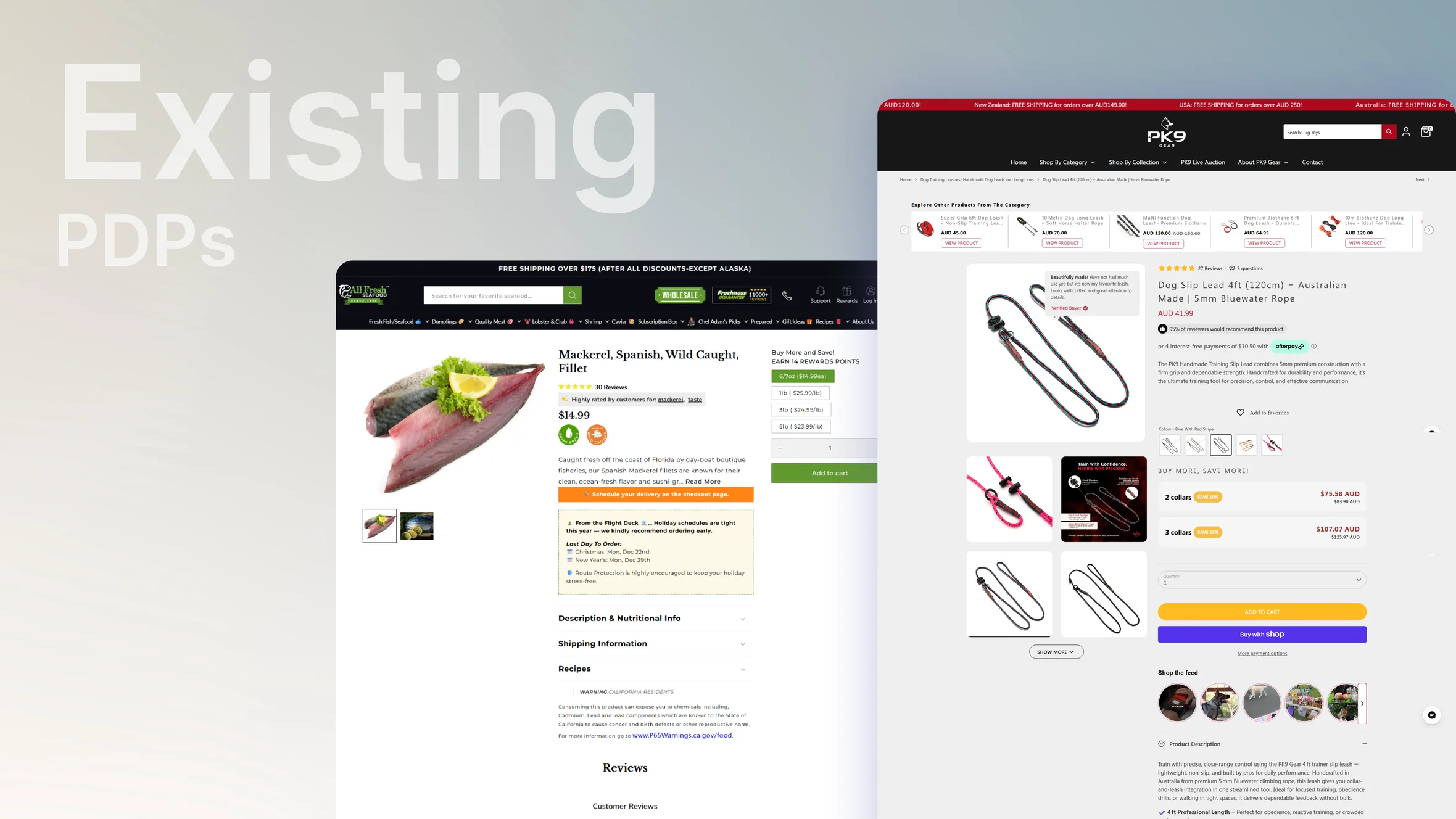
The existing PDP structures had opportunities to make the purchasing journey clearer.
Important information such as product imagery, product names, pricing, value propositions, ratings, variants, quantity selection, and primary CTAs needed stronger hierarchy so shoppers could understand the product quickly.
The challenge was not simply to make the pages look better.
The goal was to help shoppers scan, understand, evaluate, and act with as little friction as possible.
A successful PDP needed to answer the shopper’s most important questions quickly:
What is this product?
How much does it cost?
Why should I buy it?
What do other customers think?
Which variant should I choose?
How do I add it to my cart?
Defining the Problem
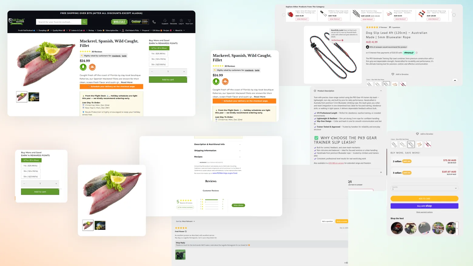
The PDP contained many important pieces of information, but they competed for attention.
Product imagery needed to establish confidence.
Product information needed to communicate value.
Variants needed to be easy to understand and select.
Reviews and ratings needed to build trust.
The Add to Cart action needed to remain highly visible.
At the same time, unnecessary spacing and competing elements could push important purchasing information further down the page.
The core problem became:
How might we organize the PDP so shoppers can understand the product and make a purchase decision quickly without feeling overwhelmed?
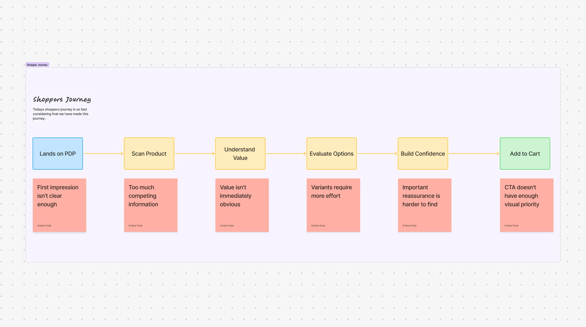
Understanding the Shopper Journey
A typical shopper moves through several questions before making a purchase decision.
Discover
What is the product?
Understand
What does it offer?
Evaluate
Is it worth the price?
Validate
Do other customers trust it?
Select
Which variant or quantity do I need?
Purchase
How quickly can I add it to my cart?
The redesign focused on reducing friction between each of these stages.
Research & Competitor Analysis
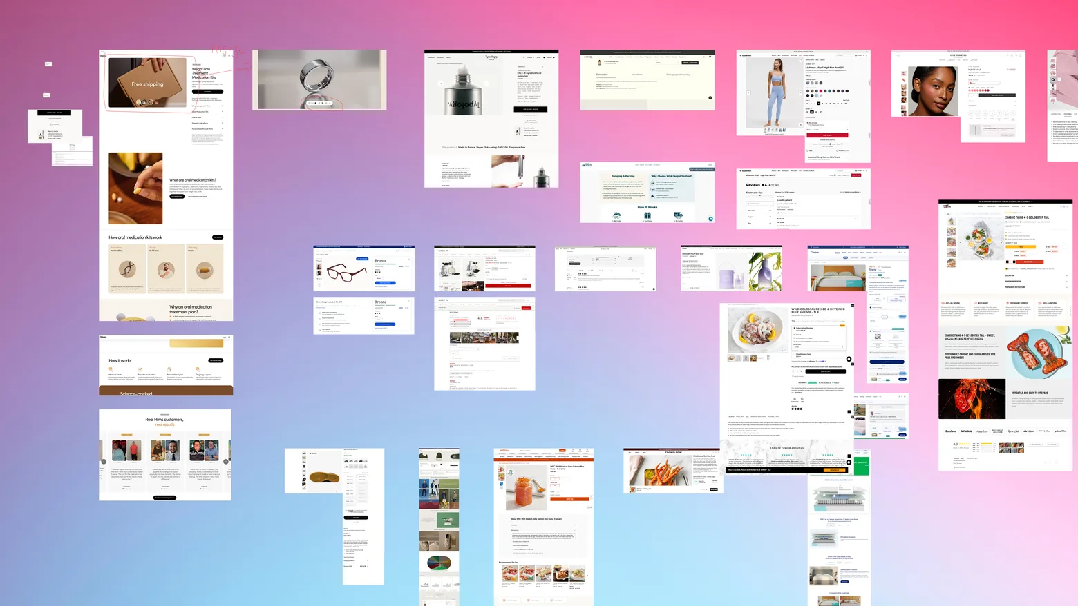
Because there is no single “perfect” PDP structure, the research focused on identifying patterns that consistently helped shoppers understand products and make decisions.
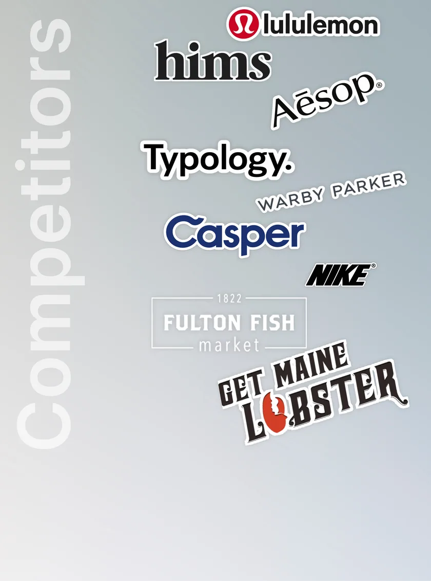
We reviewed both direct and indirect competitors across e-commerce categories to understand how different brands handled:
Product imagery
Product titles
Pricing
Value propositions
Ratings and reviews
Variant selection
Quantity selection
Purchase CTAs
Shipping and delivery information
Product benefits
Trust signals
The goal wasn’t to copy a competitor.
It was to understand why certain patterns worked and where they could be adapted to each client’s product and brand.
PDP Audit
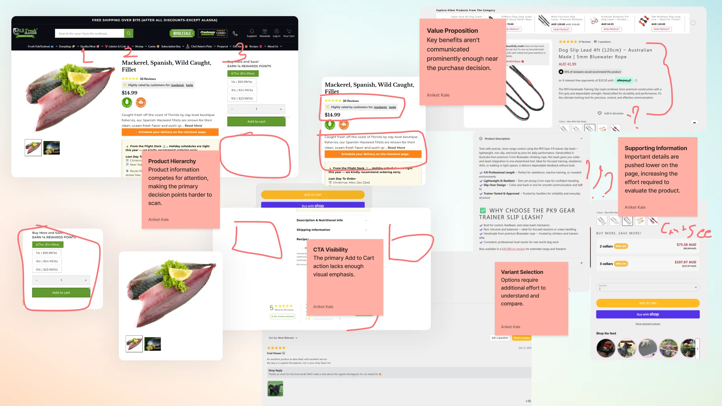
We evaluated the existing PDPs across several key areas.
Visual Hierarchy
Were the most important elements receiving the most attention?
Product Information
Could shoppers understand the product quickly?
Pricing
Was the value and price relationship clear?
Social Proof
Were ratings and reviews visible at the right point in the decision journey?
Variants
Could shoppers easily understand and select available options?
Primary CTA
Was Add to Cart clearly identifiable and easy to access?
Content Density
Was the page communicating enough without becoming overwhelming?
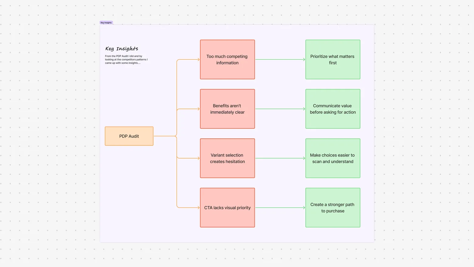
Key Insights
Shoppers scan before they read
The first view of the PDP needs to communicate the product, value, price, trust, and purchase action quickly.
Hierarchy influences decision-making
When everything competes for attention, shoppers have to work harder to identify what matters.
Variants should feel like part of the product
Variant selection shouldn’t feel like a separate interaction. It should be an obvious part of the purchase journey.
Existing brand systems matter
The redesign needed to improve the experience without creating unnecessary visual or technical complexity for development.
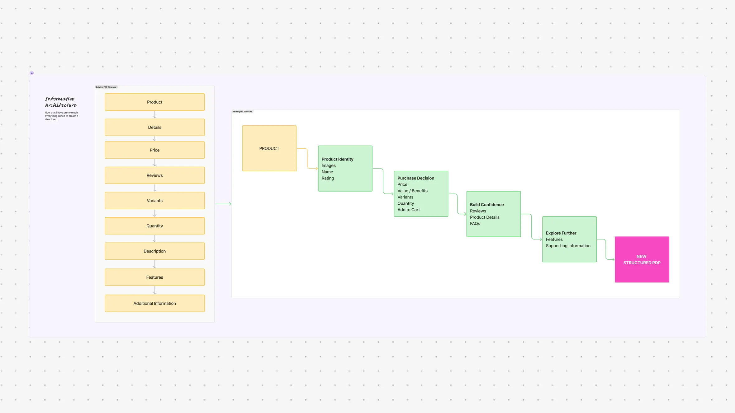
Information Architecture
The PDP structure was reorganized around the shopper’s decision-making process.
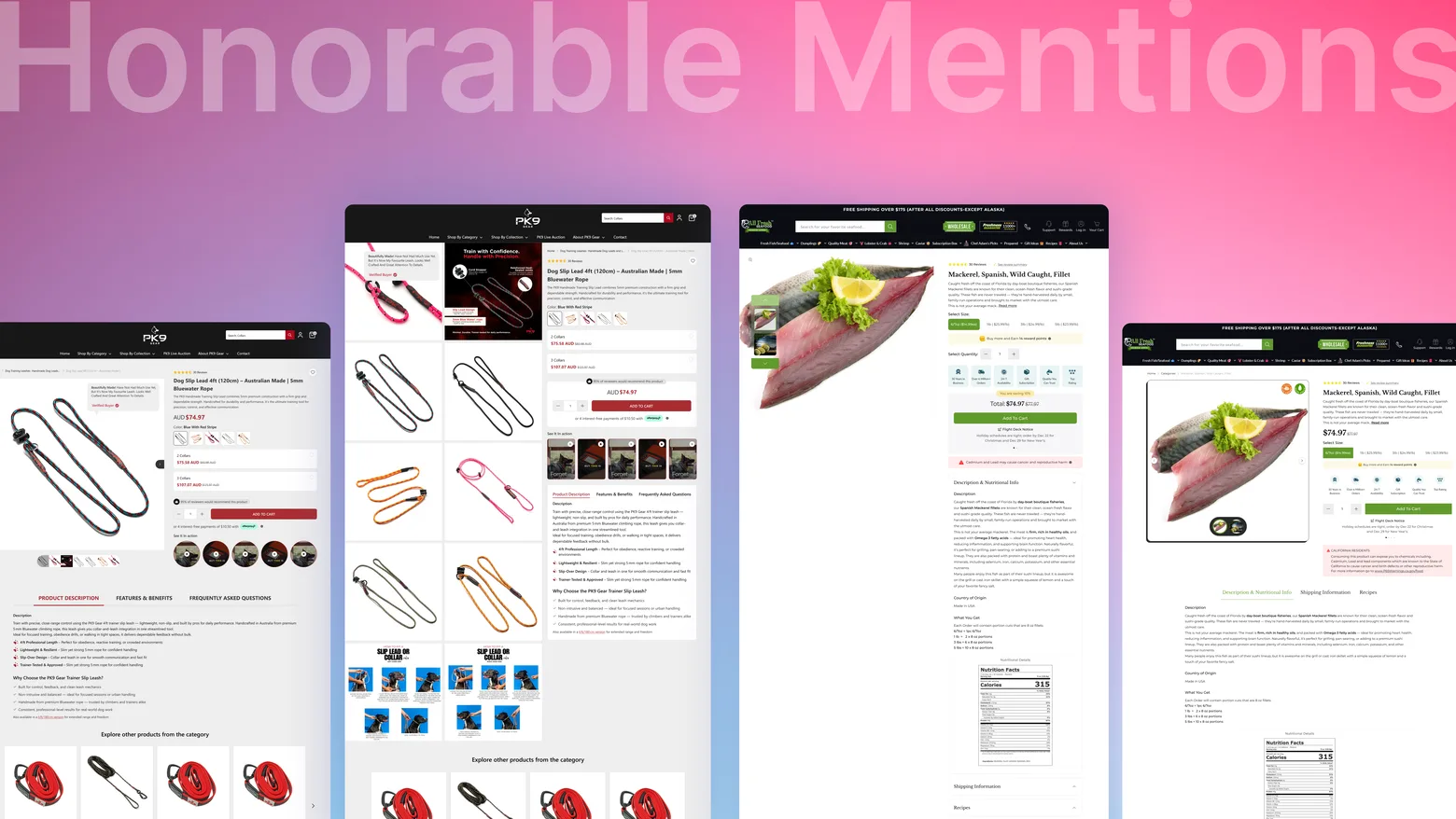
Designing the Above-the-Fold Experience
The first viewport became one of the most important areas of the redesign.
The objective was to ensure shoppers could immediately understand:
What they’re looking at
How much it costs
Why it matters
What options they have
What they need to do next
The product image and purchasing information were given stronger visual relationships so the shopper could scan the entire decision area without unnecessary movement.
CRO Outcome
The redesign was created to improve the key behaviors that influence PDP conversion:
Faster product comprehension
Improved information discovery
Easier variant selection
Stronger CTA visibility
Reduced interaction friction
Better purchase decision support
Smoother path to Add to Cart
Rather than optimizing one isolated element, the approach focused on improving the entire decision-making experience of the PDP.
Reflection & Learnings
There is no perfect PDP
Competitor research helped identify patterns, but no single website provided the complete answer.
The best solution came from combining proven patterns with the specific needs of each client.
Every element needs a purpose
A PDP can quickly become overwhelming when every piece of information is given equal importance.
Strong hierarchy is often about deciding what doesn’t need to compete for attention.
CRO and UX work together
Conversion optimization isn’t simply about making the CTA bigger.
It is about making the entire journey from understanding → confidence → selection → action easier.
Design needs to work beyond the screen
A strong solution also needs to consider development effort, existing brand systems, reusable components, and the practical realities of implementation.
Final Takeaway
A better PDP isn’t about adding more. It’s about making the right information easier to understand and act on.
Across All Fresh Seafood, PK9 Gear, and other client PDP explorations, the goal remained consistent:
Make the product easier to understand.
Make the decision easier to make.
Make the purchase easier to complete.
The redesign brought together UX, CRO, competitor research, information architecture, and interface design to create PDP experiences that were clearer, more focused, and built around the shopper’s path to purchase.