Hero Banner Redesign
Reimagining e-commerce hero experiences to communicate offers clearly, engage returning users, and create stronger paths to purchase
Redesigning the hero experience to communicate the product value faster, create a clearer visual hierarchy, and guide users toward the primary action. The revamp combines UI clarity with CRO principles to turn the first impression into a stronger conversion opportunity.
Project Overview
The homepage hero is often the first major interaction a visitor has with an e-commerce brand. It needs to communicate the right message quickly, create interest, and give users a clear reason to continue exploring the website.
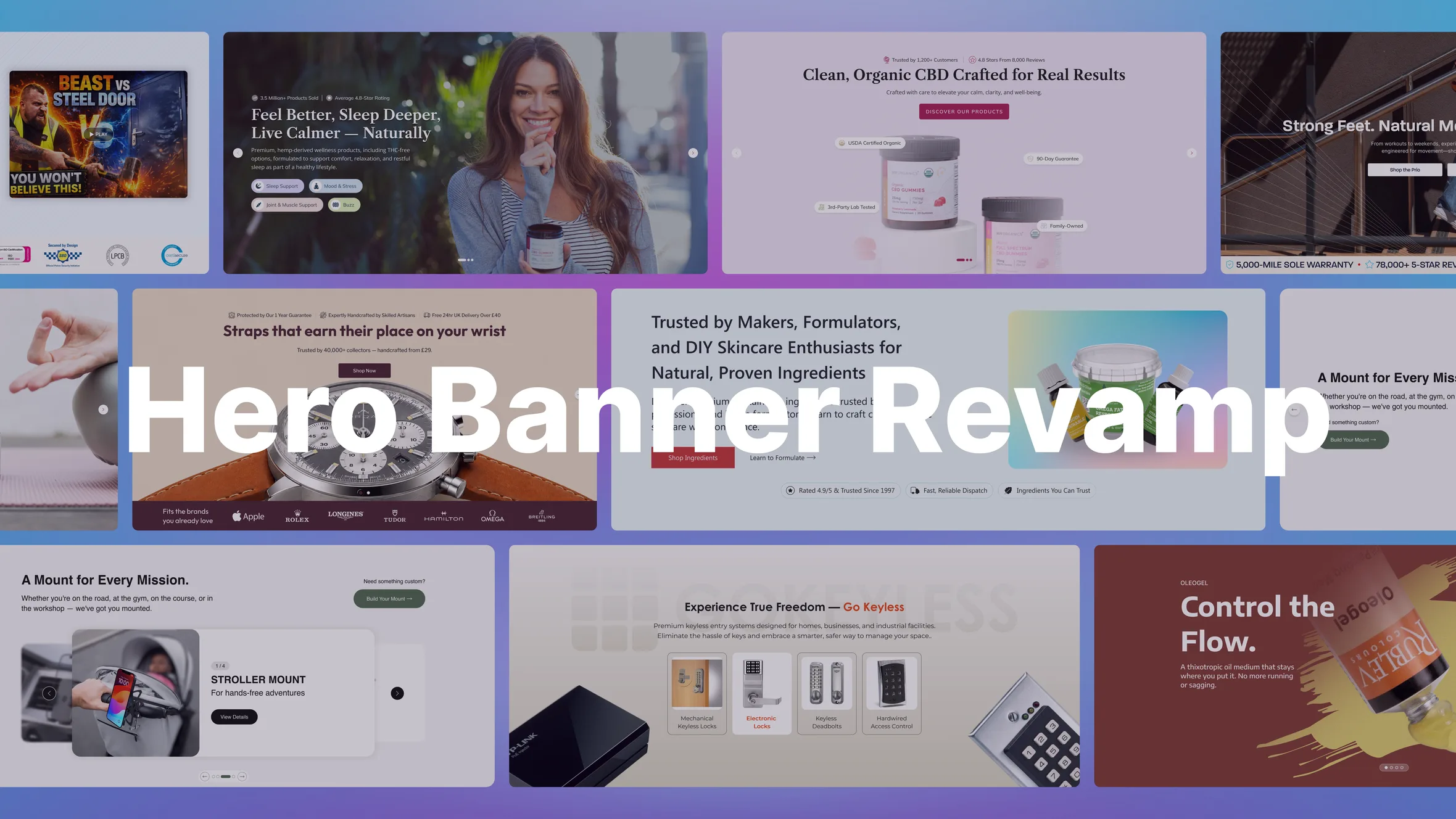
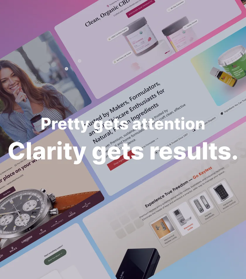
Across 9+ ConvertCart clients, I redesigned homepage hero banners to address different business goals, product categories, promotional campaigns, and user intents.
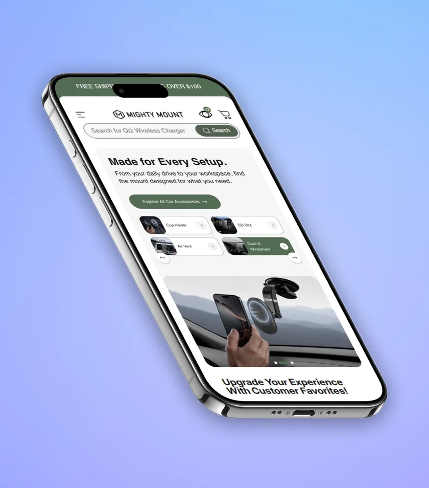
The work focused on replacing existing hero sections that were not communicating their value effectively with modern, visually engaging experiences that maintained the existing brand identity while improving hierarchy, clarity, and interaction.
Each client had different requirements. Some needed to promote a hero product, others needed to communicate offers, introduce product categories, highlight seasonal campaigns, or provide multiple paths for different types of visitors.
The common objective was to create hero experiences that looked engaging, communicated clearly, and gave users a compelling reason to continue their journey.
The Business Challenge
The primary business concern across these campaigns was homepage exit rate.
Visitors were arriving on the homepage but were not always finding a clear reason to continue.
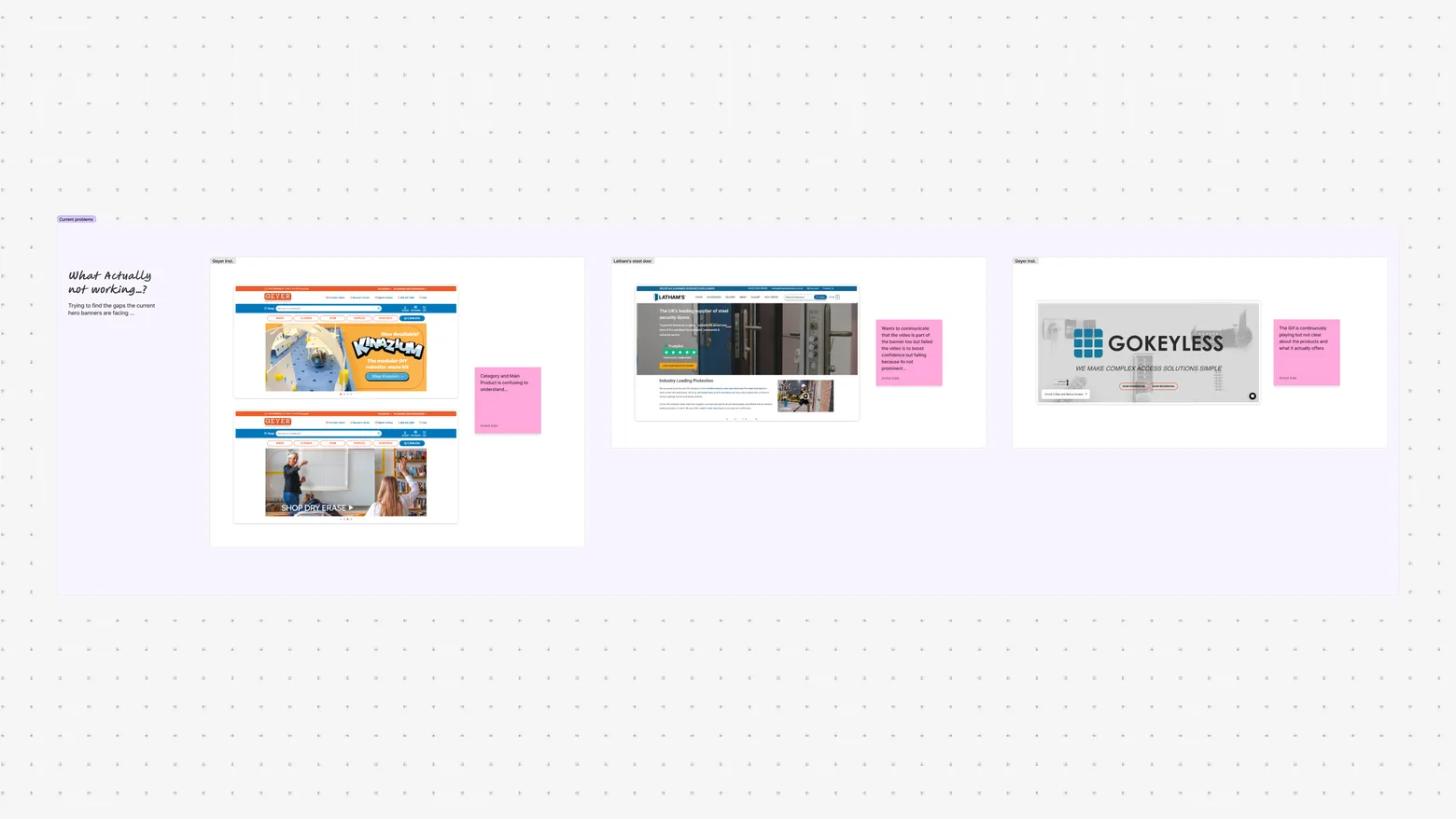
In some cases, the hero relied too heavily on a single CTA or promoted a very specific product without helping visitors understand how it related to their needs.
For example, one client brief identified that the homepage hero relied on a single niche CTA, “Shop Kinazium,” which made it difficult for visitors arriving with broader STEM or subject-level intent to understand where they should go next.
This created a gap between:
What the visitor needs
and
What the hero is asking them to do.
The challenge was therefore bigger than creating a visually attractive banner.
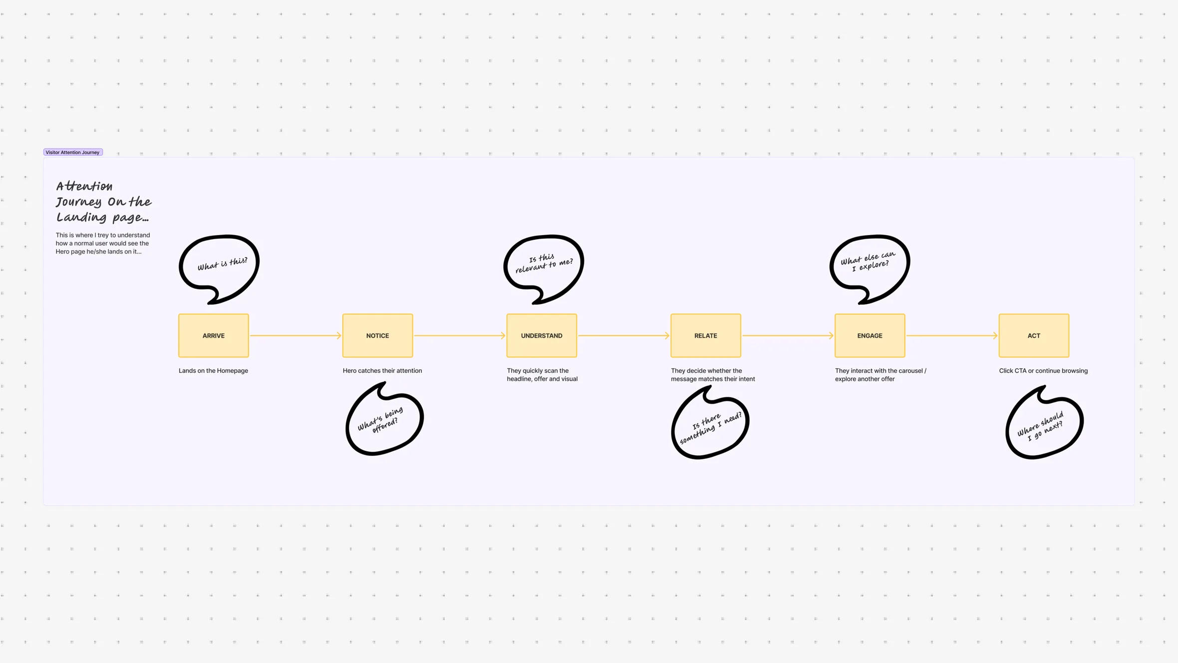
The hero needed to quickly answer:
What does this brand offer?
Is there something relevant to me?
What should I explore?
Why should I click?
Defining the Problem
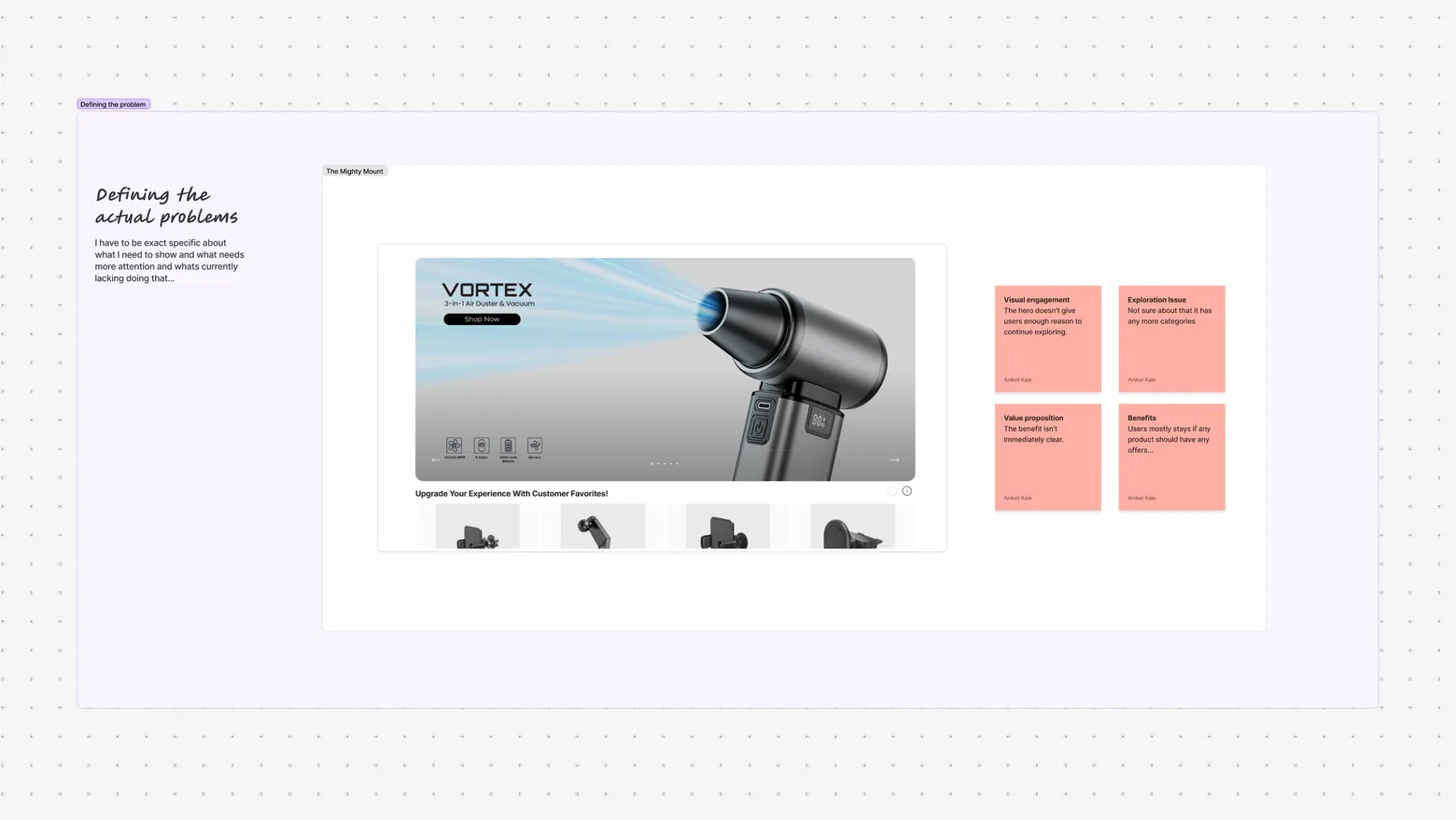
The existing hero sections often contained the right information, offers, or products, but the information wasn’t always communicated with enough clarity or hierarchy.
Important messages competed with supporting content.
Offers weren’t always immediately noticeable.
Product imagery didn’t always establish enough visual focus.
CTAs sometimes lacked context.
And in some cases, the hero was optimized around one specific action even though visitors could arrive with very different intentions.
The core problem became:
How might we redesign the homepage hero so users can quickly understand the offer, find something relevant to them, and have a clear reason to continue exploring?
Understanding the Hero Experience
The hero needed to work for different types of visitors.
New Visitors
They need to understand:
Who is this brand?
What does it sell?
Why should I care?
Returning Visitors
They may already know the brand and need:
What’s new?
What’s on offer?
What’s worth exploring today?
High-Intent Visitors
They may already know what they want and need:
A clear path to the right product or category.
This meant the hero could not rely on a single message for everyone.
The design needed to create multiple entry points while maintaining a simple and focused experience.
Research & Competitor Analysis
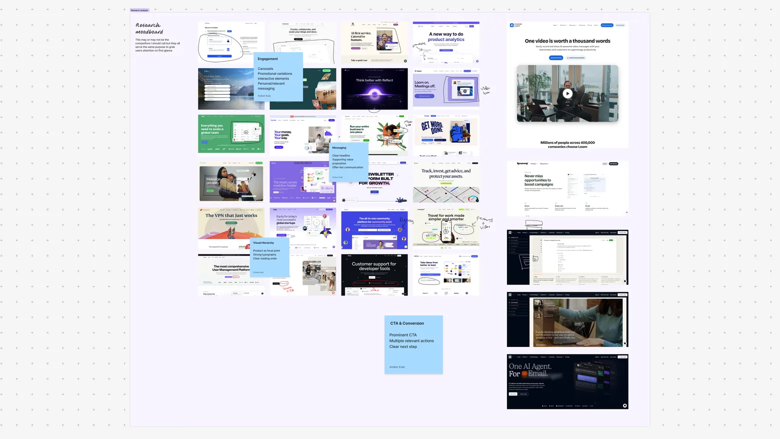
I reviewed direct and indirect competitors to understand how strong e-commerce brands approach:
Hero composition · Product presentation · Offers · CTAs · Typography · Imagery · Carousel patterns
I also used Mobbin and Pinterest to explore modern visual patterns and then adapted relevant ideas to each client’s brand.
The goal wasn’t to copy competitors, but to understand what patterns could work for each business.
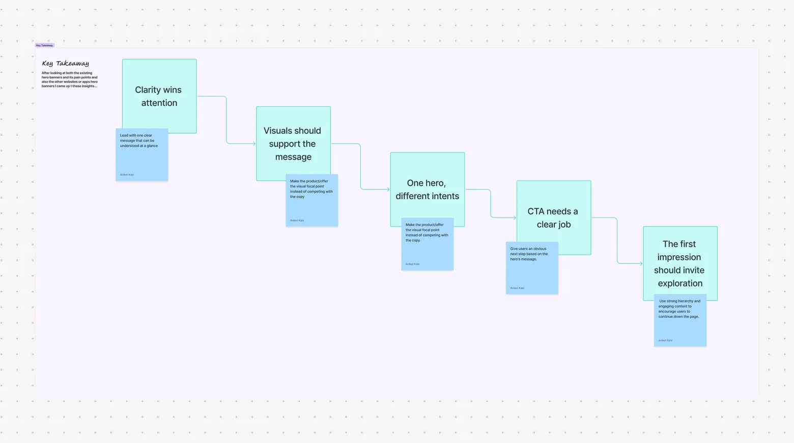
Key Insights
Visual appeal isn’t enough
A hero can look great and still fail if the message isn’t clear.
Hierarchy drives attention
The primary message, offer, product, and CTA need to be immediately scannable.
Different users need different paths
A single CTA doesn’t always work for every visitor.
Every slide needs a purpose
Carousel slides should communicate distinct messages rather than repeating the same promotion.
Designing Within the Brand
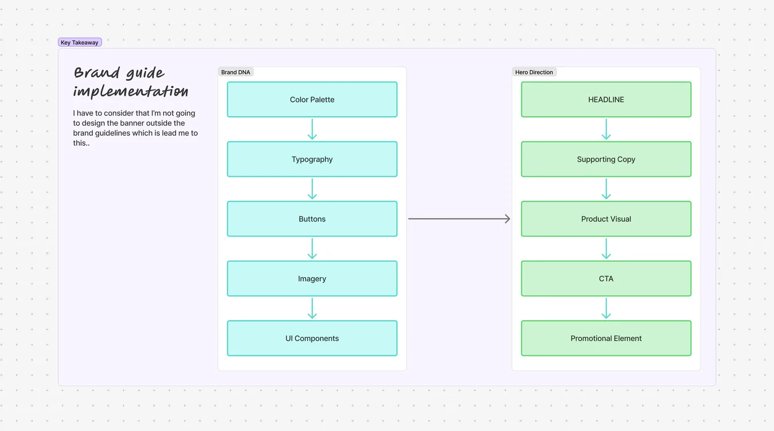
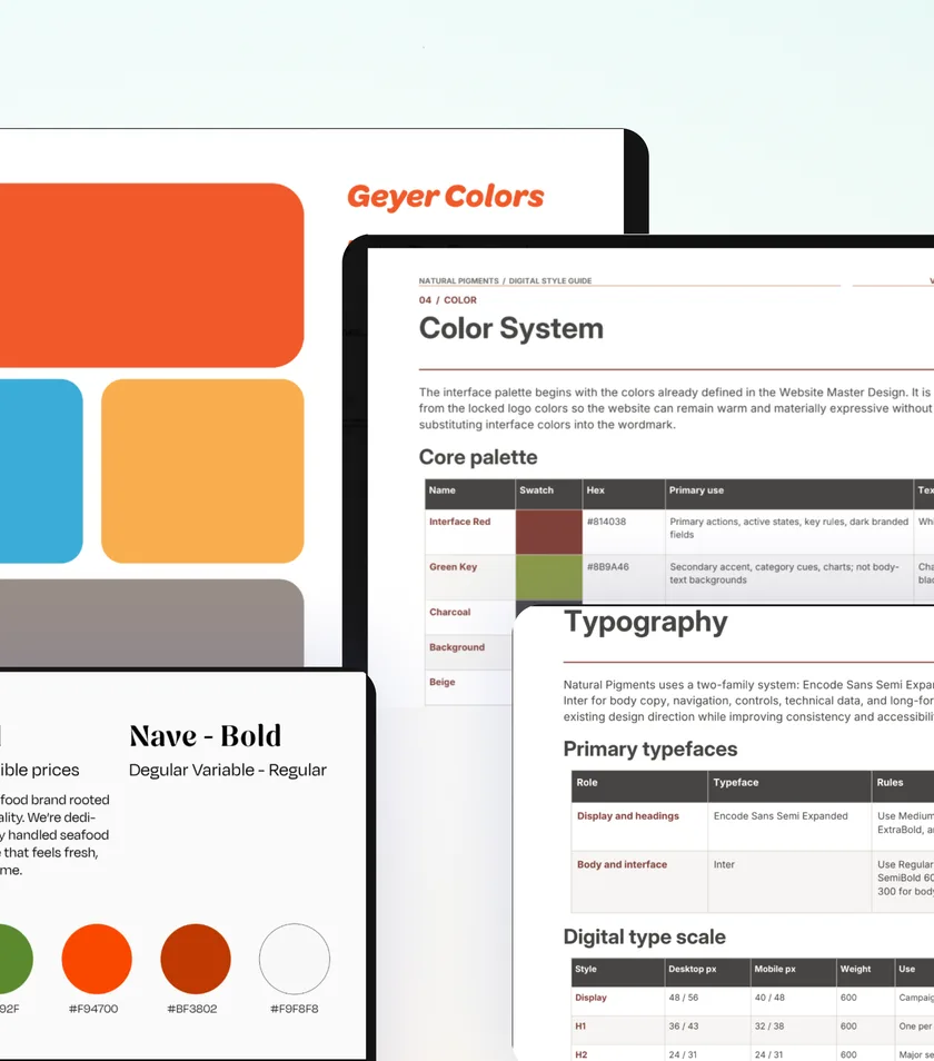
Every client had a different visual identity, so I worked within their existing:
Colors · Typography · Photography · Product imagery · Brand language
The goal was to modernize the experience without making the banners feel disconnected from the brand.
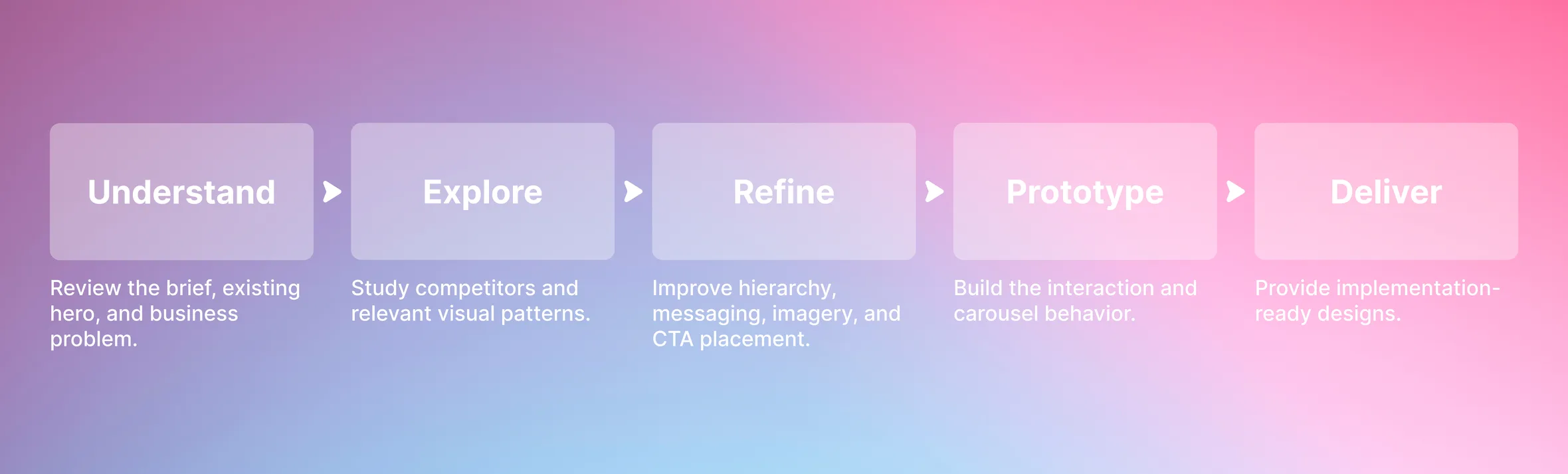
Final Solution
The redesigned heroes created clearer communication between the brand and the visitor.
Stronger visual hierarchy
Clearer messaging
More relevant CTAs
Better product presentation
Multiple discovery paths
Modern interactions
Each banner was designed around the specific product, audience, and campaign rather than forcing every client into the same layout.
Outcome
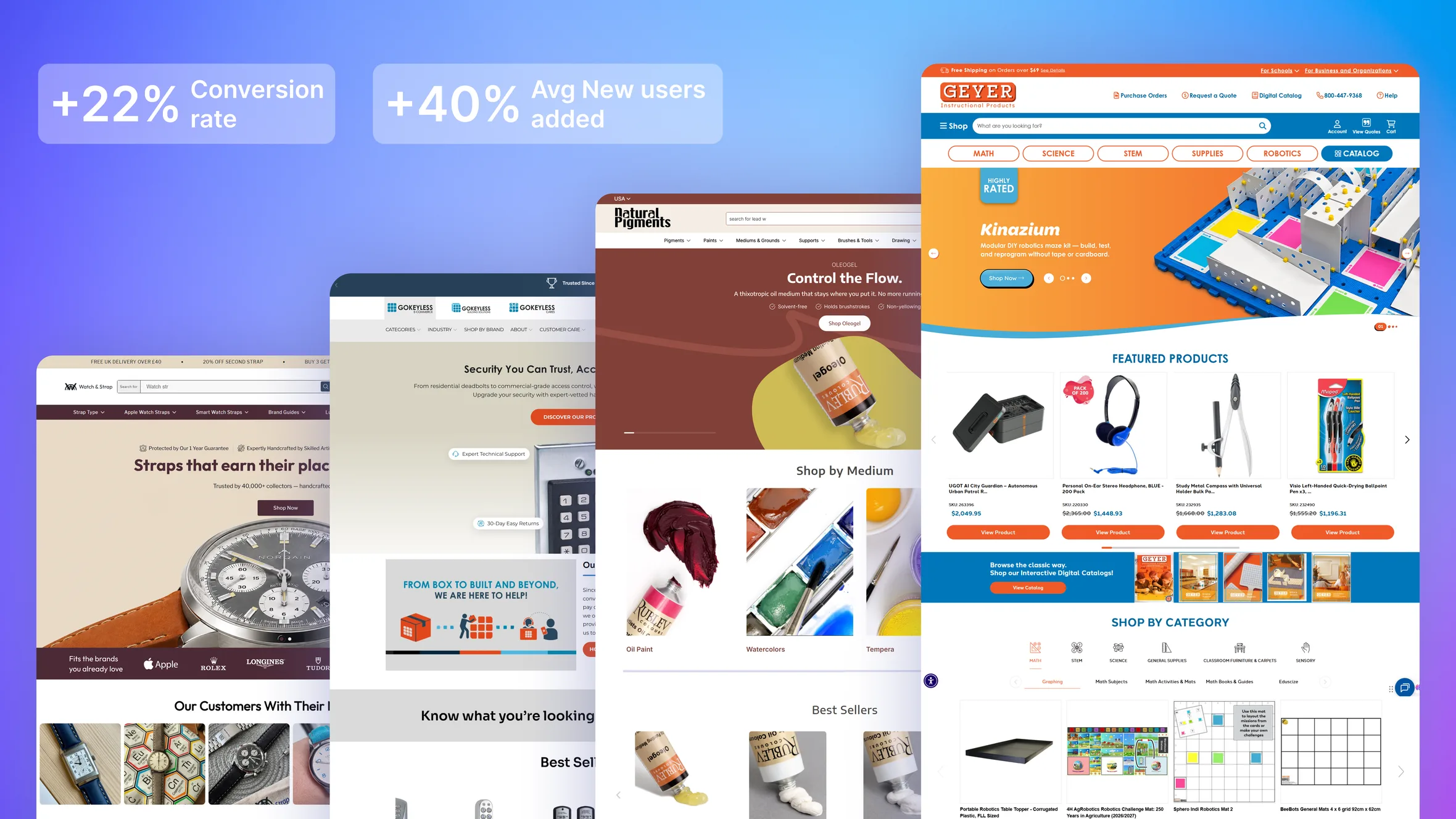
Across the campaigns, the redesigned hero experiences helped address client concerns around homepage engagement and exit behavior.
The work contributed to a reported 32% increase in revenue, while giving clients flexible hero systems that could be updated for future campaigns.
The biggest improvement was creating a clearer path:
Hero → Interest → Exploration → Product → Purchase
Reflection & Learnings
A hero is more than a banner
It is the first opportunity to communicate value and guide the user.
Clarity beats decoration
Strong visual design only works when the message is immediately understandable.
Every brand needs its own solution
The same CRO pattern doesn’t work for every product or audience.
Design systems speed up CRO work
Reusable patterns, competitor research, and rapid prototyping helped me deliver highly different hero experiences quickly.
Final Takeaway
Making the hero work harder, not just look better.
Across 9+ clients, I combined CRO, UX, visual design, competitor research, and interaction design to create homepage heroes that communicate faster, engage users, and provide clearer paths into the shopping journey.
Clearer message. Stronger hierarchy. Better interaction. More reasons to explore.